When it comes to maintaining a consistent aesthetic across all of your brand channels, it’s important that you have a strategic yet tactical guide to your visual design and appeal.
One of the most important tools for you to refine and utilize regularly is a style guide. This is your road map to assuring that your brand is represented seamlessly on every platform, and it acts as a dynamic toolkit when building out your company’s branding guidelines.
Here are three key reasons you will want to create and maintain a well-defined style guide:
- Having distinct and recognizable shapes, colors, fonts and other visual elements makes your brand memorable. Our brains remember patterns and respond to repetition. The more customers see your brand and what’s associated with it, the more likely they are to engage, and ultimately purchase.
- Within large companies especially, a style guide establishes ground rules for how your brand should look, feel, and sound, so that content writers, designers and other internal team members all stick to the same guidelines.
- Lastly, a style guide ensures your customers have a holistic impression of your brand that is consistent no matter where they interact with it.
Here are the key elements you’ll want to address in your style guide for it to be effective:
- Brand purpose: This is where you highlight your brand’s values and what you hope to achieve for your customer. This serves as a reminder to be creating content that upholds the overall company mission.
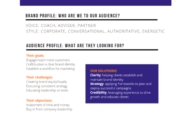
- Brand tone and voice: Ask yourself: Who are you to your customer? What do they turn to you for? Are you their motivator? Partner? Educator? How do you speak to them? Is it in an authoritative voice or in an inspirational one?
- Audience persona: Before you start speaking to your audience, you have to know what they will listen to. First, understand their goals, challenges and even the objections they might have to your product or service. Then, you articulate how your solution helps them overcome those pain points. See an example of how we defined our audience below.

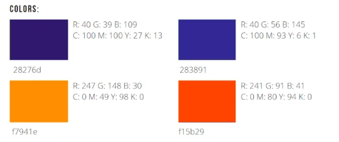
- Color palette: This group specifies which colors are associated with your brand. Typically, you don’t want to have more than three. Choose the combination that best aligns with the mood and overall aesthetic of your brand. You can also find pre-made palettes made by real designers at sites like… Don’t forget to include the Hex or RGB code associated with your color choices! See example below.

- Font: An essential part of your style guide is to include typography requirements. Make sure you specify the font name, the required sizes for different copy, and any other parameters like font pairings.
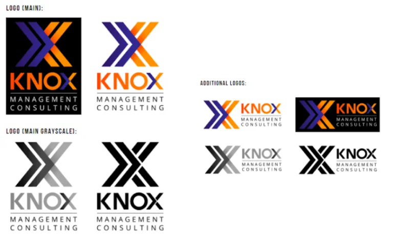
- Logos: It is vital that you not just include the primary logo used in branding. Be sure to include variations for grayscale, landscape and portrait orientation, and Any other notes about acceptable and unacceptable ways for the logo to be used. An example of our logo variations is below.


